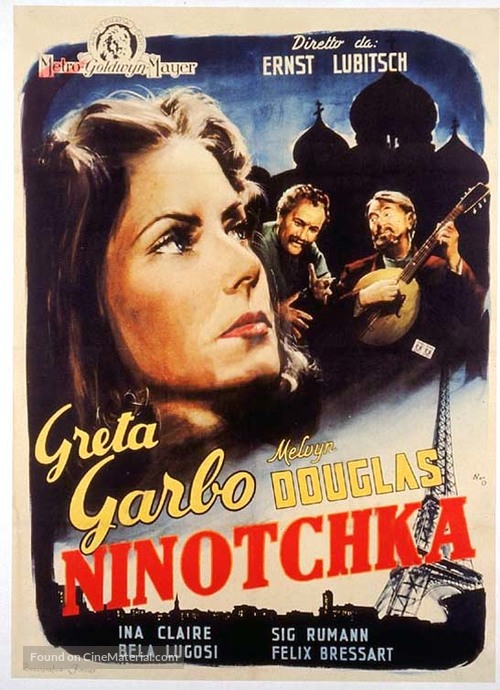
Когда-то давно я был подписан, через моё кабельное ТВ на ТСМ – Тернер Классик Мувиз. И получил массу удовольствия от классических фильмов, которые, по большей части, восстановлены, отредактированы и даже, мне кажется, раскрашены порой. Качество отменное. Приятно смотреть на большом экране на языке оригинала, и понимать тончайшие языковые нюансы картин, которые делались в то благословенное время, когда основными посетителями кинотеатров были не прыщавые подростки, жующие попкорн, а взрослые, думающие люди. Для них и делалось тогда кино, как пока ещё, слава богу, делается во Франции, правда всё меньше и меньше. Так вот, посмотрел я замечательный (в первой своей половине, то есть почти час – и это много) фильм “Ниночка”.
Итак, Елизаве́та II (англ. Elizabeth II), полное имя — Елизаве́та Алекса́ндра Мари́я (англ. Elizabeth Alexandra Mary; 21 апреля 1926, Лондон, Великобритания)
— царствующая королева Великобритании с 1952 года по настоящее время. Взошла на престол 6 февраля 1952 года в возрасте двадцати пяти лет, после кончины своего отца, короля Георга VI. Является самым долго правящим монархом за всю историю Великобритании. Елизавета II происходит из Виндзорской династии. Является главой Британского Содружества наций и, помимо Великобритании, королевой пятнадцати независимых государств: Австралия, Антигуа и Барбуда, Багамские Острова, Барбадос, Белиз, Гренада, Канада, Новая Зеландия, Папуа — Новая Гвинея, Сент-Винсент и Гренадины, Сент-Китс и Невис, Сент-Люсия, Соломоновы Острова, Тувалу, Ямайка. Является также главой англиканской церкви и верховным главнокомандующим Вооружёнными силами Великобритании. Елизавета II — старейший британский (английский) монарх в истории. В настоящее время она рекордсмен по времени нахождения на британском престоле, а равно по продолжительности пребывания в качестве главы государства среди всех ныне действующих глав государств (после кончины 13 октября 2016 года короля Таиланда Пхумипона Адульядета). Является самой пожилой в мире среди женщин — действующих глав государств, а в Европе — самым пожилым действующим главой государства. Является старейшим действующим монархом в мире с 24 января 2015 года, после смерти короля Саудовской Аравии Абдаллы ибн Абдул-Азиза Аль Сауда. На период правления Елизаветы II выпадает очень широкий период британской истории: завершился процесс деколонизации, который ознаменовался окончательным распадом Британской империи и её трансформацией в Содружество наций. Данный период также включил в себя множество иных событий, таких как длительный этнополитический конфликт в Северной Ирландии, Фолклендская война, войны в Ираке и Афганистане. На протяжении всего своего правления королева не раз подвергалась критике не только со стороны сторонников отмены монархии, но и со стороны различных британских средств массовой информации, а также простой общественности. Тем не менее Елизавета II смогла сохранить престиж британской монархии, и её популярность в Великобритании находится на высоте. Старшая дочь принца Альберта, герцога Йоркского (будущего короля Георга VI, 1895—1952 гг.) и леди Елизаветы Боуз-Лайон (1900—2002 гг.). Её деды и бабки: по отцу — король Георг V (1865—1936 гг.) и королева Мария, принцесса Текская (1867—1953 гг.); по матери — Клод Джордж Боуз-Лайон, граф Стратмор (1855—1944 гг.) и Сесилия Нина Боуз-Лайон (1862—1938 гг.).
Принцесса Елизавета Александра Мария родилась в лондонском районе Мейфэр в резиденции графа Стратмор на Брютон-стрит, дом № 17. Сейчас район перестроен, и дом более не существует, но на этом месте установлена мемориальная доска. Своё имя получила в честь матери (Елизавета), бабки (Мария) и прабабки (Александра). При этом отец настаивал, чтобы первое имя дочери было как у герцогини. Сначала девочке хотели дать и имя Виктория, но потом передумали. Георг V заметил: «Берти обсуждал со мной имя девочки. Он назвал три имени: Елизавета, Александра и Мария. Имена все хорошие, я так ему и сказал, а насчёт Виктории я с ним абсолютно согласен. Это было лишнее». Крестины принцессы Елизаветы прошли 25 мая в часовне Букингемского дворца, позднее разрушенной в годы войны. В 1930 родилась единственная сестра Елизаветы — принцесса Маргарет. Елизавета получила хорошее домашнее образование, в основном гуманитарной направленности — изучала историю конституции, правоведение, религиоведение, искусствоведение, а также (фактически самостоятельно) французский язык. С юных лет Елизавета интересовалась лошадьми и занималась верховой ездой. Этому увлечению она верна многие десятилетия.
Эти фотографии — результат пяти лет погружения в жизнь Кольского полуострова, расположенного в Мурманской области, также известного как Русская Лапландия.
Постер на стене производственного здания, Кола
Эта земля расположена на самом северо-западе России и окружена Баренцевым и Белым морями.
Кировск
Кольский полуостров, а по-старинному Кола, — суровая земля, обитатели которой справляются с двумя месяцами зимней тьмы и круглогодичной полярной погодой.
Кола — земля обетованная, Великая Северная Утопия: саамы живут здесь тысячелетиями — в прошлом они кочевали по этой земле вслед за своими оленьими стадами, а сейчас пытаются сберечь свою идентичность. Другие люди пришли сюда из всех уголков России, чтобы выстроить свою судьбу и обжить Русскую Арктику.
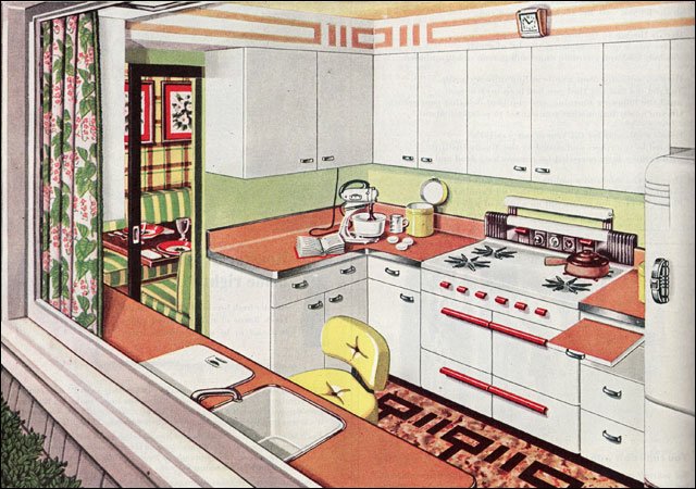
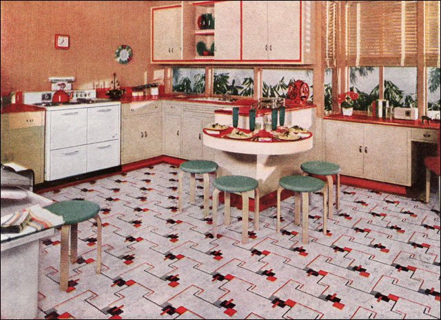
1940 Armstrong Polka Dot Kitchen – Стеклянный блок появился в 1930-х годах, и в сочетании с чистым обтекаемым дизайном позднего периода деко эта кухня выглядит очень современной. Горошек, оборки и вездесущая герань делают интерьер непринужденным и привлекательным, при этом он не становится слишком дизайнерским.
Дальше без перевода, сорри. В принципе всё понятно и так.
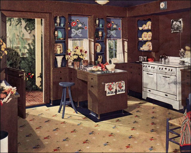
1940 Armstrong Kitchen in Brown and Blue – Most kitchen designs were lighter and brighter than this dark chocolate brown kitchen. Blue accents and white appliances provide some relief in this “gardener’s kitchen” as it was referred to in the ad which ran in American Home.
1940 Nairn Linoleum Ad – Very Pink Kitchen – This Nairn ad ran in the American Home magazine and it’s really pink. The combination of pink and navy blue isn’t uncommon but the amount of pink is. Even the ceiling is a lighter shade. It really makes those white appliances and red accessories pop.
1941 Nairn Linoleum Kitchen – Shown in an American Home magazine, this classic red, light tan, and green scheme has lots of clean modern elements. As an ad for Nairn, one of the oldest flooring companies in the US, the linoleum was the featured element, but the tan walls and red linoleum counters make a nice counter point to the green-topped Aalto stools. Also seen regularly were the window walls under the cabinets. We should be so lucky to have more of those today!
1942 Armstrong Family Kitchen – Armstrong ran full color ads throughout the Depression and WWII advertising their various flooring, wall, and insulation products. Unlike many companies they had a dedicated staff responsible for coming up with new room ideas constantly. Though “high designers” like Raymond Lowey and Russell Wright influenced the direction of interior design, it was companies like Armstrong that appealed most directly to the primary decision maker … the American housewife.
1942 Armstrong Pennsylvania Dutch – The folkloric style is one that surfaces here and there consistently throughout the 20th century. Painted Pennsylvania Dutch flowers and birds, an Early American theme, and antiques (or wannabes) create a traditional, comfortable look that appealed to many home owners.
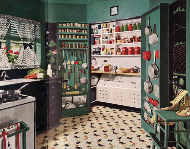
1945 Armstrong with Working Pantry – This kitchen is dark with the black and green prominently featured in the scheme. The white of the pantry and light floor serve to minimize the light absorbing qualities, but it’s the functionality of the pantry that steals the show. It’s fully functional for baking and other food prep chores. When not in use the doors close and the kitchen becomes neat and tidy.
1945 American Gas Association Kitchen – This kitchen ad appeared in Ladies Home Journal in mid 1945. It may have been the first of the New Freedom Gas Kitchen ads published. This one is notable for its blue, white, and yellow color scheme and no name … the rest of the kitchen designs had names.
1945 Picture Window Kitchen – Immediately after the war, the American Gas Association launched its New Freedom Gas Kitchen campaign. This image appeared in Ladies Home Journal as the “Picture Window Kitchen.” Most kitchens were named to reflect their primary characteristic. This apple green and melon-colored kitchen was bright and cheery.
1945 Tiny Armstrong Kitchen – This kitchen is a tiny 6’x6’. The open door is designed to function as a step to access upper cupboards. After WWII, many people were still living in cramped quarters so small, attractive kitchen designs would have appealed to many people including apartment dwellers.
1945 Congoleum Linoleum Rug – This 1945 Congoleum ad was published in Ladies Home Journal and reflects the continuation of 1930s style. Unlike its main competitor, Armstrong, the Congoleum company was more erratic in its advertising style. This kitchen would be pretty easy to replicate today though with contemporary linoleum on the floors and counters right down to the gooseneck faucet on the sink. Red, green and white is a timeless color scheme.
1946 Crane Kitchen – This ad was published in American Home magazine. The color scheme of white, yellow, and green is very calm and the lack of clutter is very attractive. Unlike many Early American interiors, there no busyness — the simplicity here is unusual.
1946 AGA Kitchen Laundry Combination – This ad was published in Ladies Home Journal and featured one of the American Gas Association’s New Freedom kitchens. The color scheme of red, green, and yellow (or gold) has always been a popular combination. The counters and floor were probably both linoleum though in a few short years, plastics like Formica would begin to dominate the market.
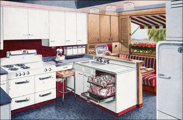
1947 AGA Americana Kitchen – The Americana kitchen was published in American Home magazine among others and reflected the optimistic patriotism of the winners of the Second World War. The glass block between the stove and breakfast booth is a nice mid-century touch.
1947 AGA Mixing Corner Kitchen – This ad for a “Mixing Corner Kitchen” was published in American Home magazine. Red, green, yellow, and crisp white steel cabinetry was a classic color combo. The steel cabinetry was big during the post-War years as companies retooled to meet the needs for kitchen cabinets instead of machine gun turrets.
1947 AGA “Old House, New Kitchen” – Intended to appeal to owners of older homes who may have wanted a kitchen update for their mid-1920s house, this ad by the American Gas Association was published in American Home. During the post-War years, they published a series of attractive color illustrations reflecting the current trends in kitchen design.
1947 AGA Shipshape Kitchen – A variant on the popular red, white, and blue theme replaced the red with a maroon. This kitchen design shows all the amenities desired by the American homemaker after WWII including the stand mixer, built-in dishwasher, and a brand new gas range. We like the small breakfast booth.
1947 American Standard Kitchen – This small brochure, published by American Standard, shows colors that were muted and toned down. The combinations ranged from odd (to our eye) to very sophisticated. This color scheme comes from the palette of colors in the brochure: Ivoire de Medici, Corallin, Clair de Lune Blue, and T’ang Red.
1948 Armstrong Kitchen With Pantry – Keeping a small kitchen tidy, but functional, is as much a challenge today as it was in 1948 when this ad appeared in American Home magazine. In keeping with the post-War period, it is yet another example of the popular red, white, and blue color scheme that captivated many American homeowners.
1948 Armstrong Kitchen – This ad for a very busy, multifunction kitchen appeared in American Home in 1948. Regardless of how you feel about the color scheme or layout, this kitchen packs a lot of function into a small footprint.
1948 Armstrong Kitchen Ideas – If you like kitchens with scallops, this is the one for you. Here’s an interesting design, again in red, white, and blue, with lots of over the top scallops in the floor and trim. A lazy-susan corner cabinet shows how easy it is to design functional storage in a small foot print … especially if hubby has a workshop in the basement.
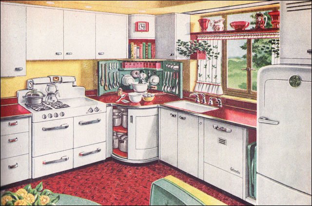
1948 Armstrong Kitchen With Working Pantry – Right after WWII, the lead designer at Armstrong seems to have been quite taken with the idea of a working pantry that could be closed off when not in use. This one features an accordion-style door on a track, which was quite a space saver. Everything is tidy and organized — a feature that wouldn’t have been lost on many homemakers.
1948 Modern Armstrong – This modern style kitchen shows Armstrong linoleum off to good advantage. The cabinets have tambour doors, a post War design feature that appears in many publications of the period. Eat in kitchens were also desirable and many had both a booth or nook and a counter breakfast bar.
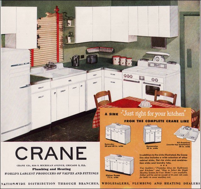
1949 Crane Kitchen – During the 1920s Crane advertised broadly and in color. During the Depression and through WWII, their ads were primarily in black and white. All that changed after the War when they began advertising using both color illustrations and photos.
1949 Youngstown Kitchen – Advertising during the 1940s and ’50s was often cute and followed a theme. This image is from a Youngstown ad that touted the wonderousness of their steel cabinets. Each ad has some kind of happy family image that has since come to embody our understanding of the period. The kitchens depicted were modern, clean, and affordable … all good reasons to buy them. Finding steel cabinets now has become somewhat challenging, but they work up really well in retro kitchen renovations. Some people sand them down and have them refinished by auto painters.
1949 Armstrong Kitchen – Shown in Ladies Home Journal, this Armstrong ad has the creative storage ideas as well as their latest linoleum pattern to entice home owners considering an update to their kitchen. Some of the ideas like the shallow wall storage and drop-leaf work space would maximize the functionality of many of today’s kitchens.
1949 Bird Linoleum Kitchen – This ad for Bird linoleum is interesting both for its design, which is more typical of the pre-WWII period than the late 1940s and its relative rarity. Though Bird had been in business for decades it was never as large as the main flooring companies and advertisements like this one are unusual.
1949 Pabco Linoleum Ad – This ad for Pabco linoleum appeared in Ladies Home Journal and is included here because it’s color scheme foreshadows some of the color schemes that would come to be enormously popular during the 1950s … in this case, turquoise, orange, and brown.
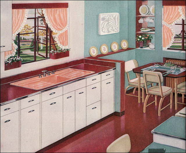
1949 Ladies Home Journal Kitchen Article – This image came from an article that ran in Ladies Home Journal. Another image showed the corner table and banquette seating. The pink is a modern departure from the more common color schemes with dark green, mint green, and white lightening it up. The wallpaper over the range with its giant cabbage rose wallpaper is used on the entire wall over the banquette.
1949 Youngstown – Another Youngstown kitchen uses the red, green, and gold color scheme to contrast with the crisp white and cabinetry and black counters.
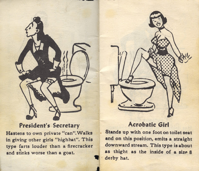
Тихуанские библии (Tijuana bibles) были порнографическими комиксами размером с ладонь, выпускаемыми в Соединенных Штатах с 1920-х по начало 1960-х годов. Их популярность достигла пика в эпоху Великой депрессии. Большинство тихуанских библий были непристойными пародиями на популярные газетные комиксы того времени, такие как “Блонди”, “Барни Гугл”, “Мун Маллинс”, “Попай”, “Тилли труженица”, “Дети Катценджаммера”, “Дик Трейси”, “Маленькая сиротка Энни” и “Воспитание отца” (“Blondie”, “Barney Google”, “Moon Mullins”, “Popeye”, “Tillie the Toiler”, “The Katzenjammer Kids”, “Dick Tracy”, “Little Orphan Annie”, and “Bringing Up Father”). Другие использовали персонажей популярных кино и спортивных звезд того времени, таких как Мэй Уэст, Кларк Гейбл и Джо Луис (Mae West, Clark Gable and Joe Louis), иногда с немного измененными именами.
До Второй мировой войны почти все истории были юмористическими и часто представляли собой карикатурные версии известных грязных шуток, которые ходили по кругу в течение десятилетий. Художники, писатели и издатели этих брошюр, как правило, неизвестны, поскольку их публикация была незаконной, тайной и анонимной. Качество работ варьировалось в широких пределах. Речь идет о откровенных сексуальных эскападах, обычно с участием известных персонажей газетных комиксов, кинозвезд и (редко) политических деятелей, неизменно используемых без уважения к закону об авторском праве или клевете и без разрешения. Типичная библия представляла собой восьмипанельный комикс, умещавшийся в бумажнике размером 2,5 × 4 дюйма (64 × 102 мм) с черным шрифтом на дешевой белой бумаге и объёмом в восемь страниц.